
Aurora Study no. 11 – Well, I do have a few earlier experiments lying around, but honestly, it’s not like these version brought any major change compared to the previous attempts. With no. 4, I tried refining the original approach—adding an alpha channel, mapping colour to alpha for a transparent aurora, and tossing in a bunch of stars. After tweaking exposure and a few other bits, I ended up with more or less the same result. So, not really a big step forward, but here’s the shot anyway.

For Study no. 6, I decided to mix things up a bit—still using a dark background and the aurora on top, but this time I went for a more colourful version. Up until now, I assumed the layer (the aurora bit) needed to be roughly the same format as the background, but turns out a square version actually works better—especially when everything’s nicely distributed and you’ve got a bit more wiggle room for shifting things around.
I resized it just above the target image size so there’s space to play with (image → scale image), then placed the aurora at the top, right over the lighter part of the background. The darker area stayed empty, which gives a nice smooth transition. I’ll drop the command below for anyone who’s curious.
So yes, we were still experimenting with all sorts of tweaks—and there’s more on the way, just keep reading!

Then I thought, why not push things a bit further? Adding stars sounds fun, but AI has a real knack for throwing them absolutely everywhere—usually in places you don’t want. So, if you’re experimenting with your own overlays, think twice about what you feed your AI at the command line!
Colour, on the other hand, really does change the game. I went for a more vibrant version of the aurora borealis and fully switched to a square template—light grey at the top, blending into a darker grey at the bottom, with a transition right in the middle. This gave me way more control over what the AI would do: “Fill the top with light grey, leave the bottom dark grey”—and voilà.
That’s how I ended up with an even bolder overlay, which became Study no. 11.
Making the template larger made it a lot easier to manipulate on the final layer, too. And those lighter greys worked out much better as an overlay base in GIMP.
Here’s an example you can use in ChatGPT to create a template:
By the way, there’s a good reason for making a template—especially a square one. ChatGPT or any other AI image creator can have a tough time placing your image exactly where you want it. Working with formats like 16:9 or specific pixel dimensions is often trickier for the AI to handle. That’s why it’s better to prepare most of this up front. The AI uses your template as a guide, so it’s much easier for it to process things the way you intended.
Ask ChatGPT:
Create a square image (1536×1536 pixels) with a very soft, natural gradient from light gray at the top to a darker gray at the bottom. The transition should be smooth and centered in the middle of the image, with no harsh lines. The result should look like a neutral, modern photo background or overlay template.
Tips:
- For a lighter look, use even paler grays (e.g. #f2f2f2 to #b0b0b0).
- For a more dramatic look, use a steeper gradient or darker bottom color.
- To keep it photo-realistic, avoid banding or artificial effects.
And if you want to create an Aurora Borealis, you can use this prompt:
Create a square image (1536×1536 pixels) suitable as a template or overlay, with a realistic, natural-looking aurora borealis (northern lights) filling the upper half. The aurora should blend smoothly between multiple colors—green on the left, blue in the middle, pink or red toward the edges, and hints of purple—creating a gentle, flowing transition. The lower half of the image should remain a soft, neutral gray gradient, fading from lighter at the middle to darker at the bottom. The transition between the aurora and the gray gradient must be smooth and natural, with no harsh lines or artificial effects. The image should look like a photo background for creative use.
Tips:
- The aurora should appear delicate, with soft ribbons or flowing shapes, and the night sky above can include a few subtle stars.
- The colors must not be oversaturated or cartoonish—aim for a subtle, photographic effect.
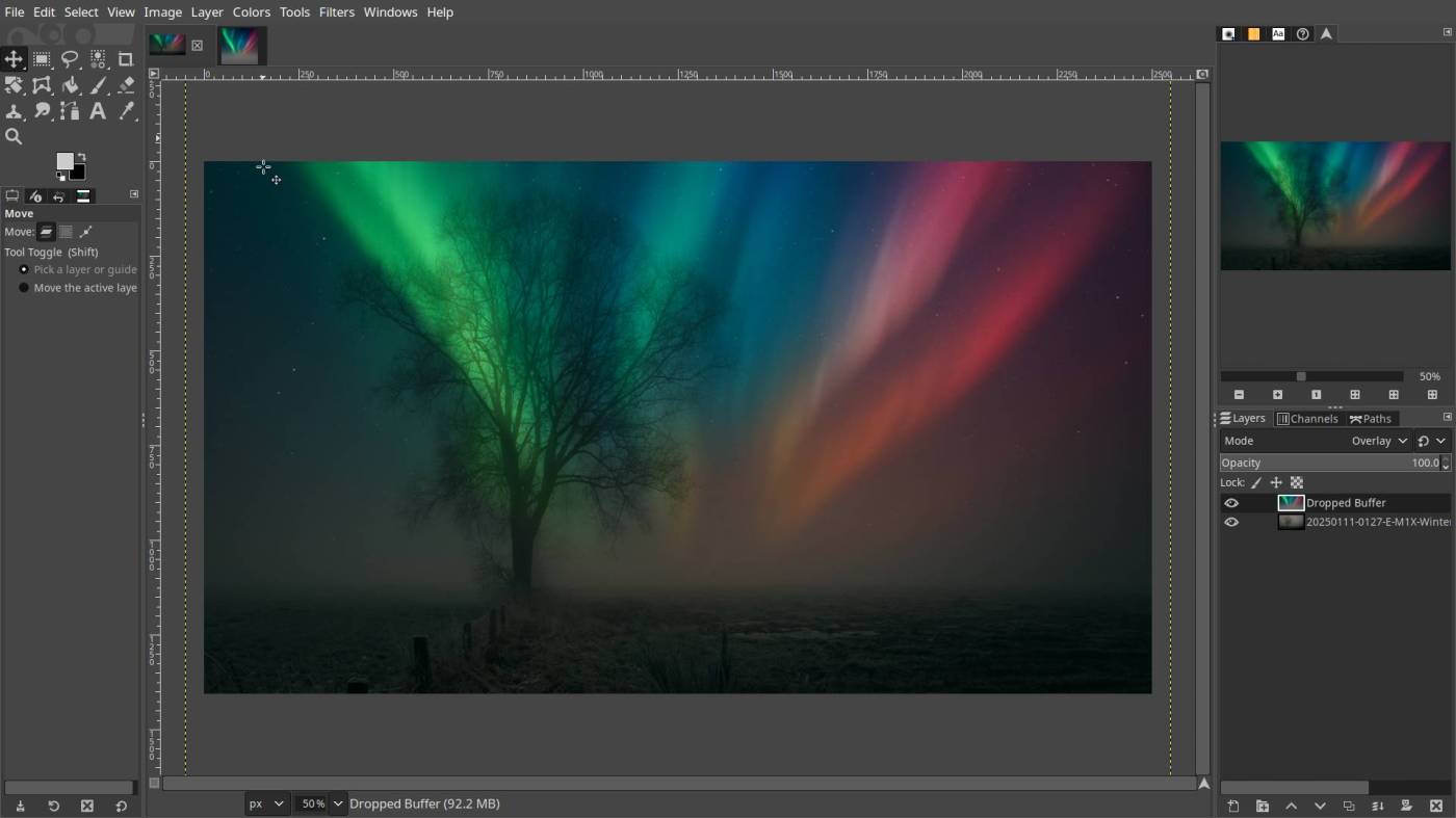
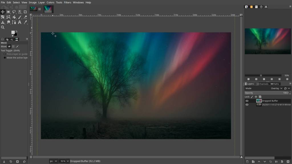
f you’re not quite sure how to add the layer (the aurora borealis, in this case), just follow these steps:
🛠 Workflow (GIMP 2.10.25 or higher)
- Open your base photo (mine was a simple shot with a tree silhouette).
- Open the aurora image separately.
- Click the aurora tab and drag it into the tab of the base image. Hover over the image and release — this adds the aurora as a new layer on top.
- In the Layers panel, select the aurora layer and set its mode to “Overlay” or “Screen”.
- Adjust opacity to taste.
✔️ Done.

Which one looks the most realistic? Well, if you ask my wife—absolutely none of them! Good thing I wear the pants in this house… at least when she’s not around. 😉
But honestly—maybe not from a strictly photographic point of view, but more as a creative exercise—I think all the versions work in their own way, with a special mention for the last two. It’s all personal taste, isn’t it? Yours will probably be different from mine! Either way, it’s fun, and you end up making something unique—a little piece of art. So, hats off to anyone brave enough to share their experiments, because trust me, you’ll get your fair share of criticism (speaking from experience here).
Play around with layer modes, exposure, all that good stuff. Make your aurora canvas a bit larger than your own photo—but since the templates aren’t massive, try to find a balance between shrinking your target image and enlarging the aurora overlay.
Have fun!
This article was written by Marc R.
While I primarily speak Dutch and have some knowledge of English and a little French, ChatGPT helps ensure my writing is grammatically correct. I often mix Dutch and English in my drafts, and ChatGPT steps in to translate and correct.
I don’t have any Sponsoring Companies, Patreon support, or Follower Donations.
I don’t drink Coffee, well, I do … but not the financial form you sometimes find on other websites, like ‘buy me a coffee’ 😊
However, what I truly need to keep going is Motivation, and the best part is, it won’t cost you a thing. You can offer it for free – just hit the Like button and Subscribe !
Discover more from Open Source Photography
Subscribe to get the latest posts sent to your email.


You’re getting great results.
We’ve been lucky this year (or the end of last year) to have been able to see this phenomenon from our back garden. It is really spectacular!
LikeLiked by 1 person
That must be amazing Mark ! Where I live, it’s pretty much impossible to see anything like that thanks to all the light pollution from the nearby industry and city lights just a few kilometres away. So, I’ll just have to settle for the digital version.
LikeLiked by 1 person
Love how you break down the creative process with practical tips and humor—making aurora overlays feel both accessible and fun!
LikeLike
Hey Ilze, thanks!
Funny thing—whenever I’m running low on inspiration, I tend to start these little projects by just picking an old photo and getting creative with it. It kind of jump-starts my own motivation and sometimes sparks ideas for new projects. That’s why I like to share it—who knows, maybe it inspires someone else too.
Have a great day, Ilze!
LikeLiked by 1 person